In this portfolio spotlight, we take a closer look at the logo Dzone Ads designed for PMBIC — Pookoyathangal Memorial Badriyya Islamic Complex, Badriyya Nagar, Vadakkangara, Malappuram.
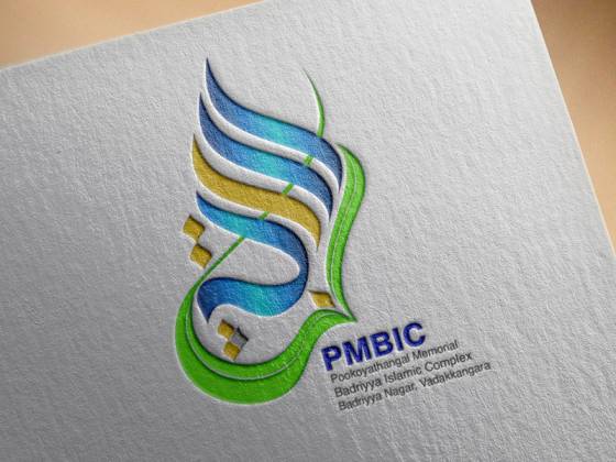
The Design
The PMBIC logo is a stylised calligraphic mark. It is built from flowing calligraphic strokes in blue, teal-green and yellow-gold, which together form a single, unified emblem. Beneath the mark sits the “PMBIC” wordmark, giving the logo a clear, readable name that works alongside the calligraphy.
The combination of a calligraphic emblem and a simple wordmark is a practical choice for an institution. The emblem carries character and identity, while the wordmark makes sure the name is instantly readable — on a signboard, a letterhead or a social media profile.
What Makes a Calligraphic Logo Effective
Calligraphic logos are rich in tradition, but they need careful design to work as modern brand marks. Here are some of the qualities we aim for:
- Flow and rhythm: strokes that move naturally and form a balanced shape.
- A considered colour palette: a small set of colours, such as blue, green and gold, used with purpose.
- Readable pairing: a clear wordmark that supports the calligraphic emblem.
- Scalability: a mark that remains recognisable at small sizes and impressive at large ones.
- Versatility: versions that work in full colour and in a single colour for printing and seals.
Explore More of Our Work
The PMBIC logo is one of many identities we have created for educational, religious and cultural institutions. You can see more examples in our portfolio, or read about our logo creation service to learn how we approach each project. If you are curious about our full process from brief to final files, our How We Work page explains every step.
Looking for a logo with character and meaning? Request a quote or contact us to start your project.