A poster has a few seconds to do its job. Whether it is pasted on a wall in a busy town junction, standing as a flex board outside a shop, or appearing in someone’s Instagram feed, people glance at it while walking, driving or scrolling. In that moment, they need to understand what it is about and whether it matters to them. Good poster design is not about filling space with decoration. It is about guiding the eye, creating contrast and delivering one clear message, fast.
Start with one clear message
The most common reason a poster fails is that it tries to say too much. A shop wants to announce a sale, list ten products, show three phone numbers, mention home delivery, add festival greetings and include every branch address. The result is a wall of text nobody reads.
Before design starts, write down the answer to one question: if someone remembers only one thing from this poster, what should it be? That might be “Onam sale, up to 40 percent off”, “Admissions open for the new academic year” or “Grand opening this Friday”. Everything on the poster should support that single idea.
Write a tight brief
- Purpose: announce, sell, invite, inform or remind?
- Audience: who should notice it, and where will they see it?
- Main message: one sentence, ideally under ten words.
- Supporting details: date, time, venue, offer terms, contact.
- Action: what should viewers do next: call, visit, scan, register?
- Formats: print sizes, flex banner, social media post, WhatsApp status.
Visual hierarchy: decide what is seen first, second and third
Visual hierarchy is the order in which the eye moves through a design. On an effective poster, it is deliberate. A simple and reliable structure uses three levels:
- Level one, the hook: the headline or main image. It is the largest, boldest element and should be readable from a distance.
- Level two, the context: a subheading or key details that explain the hook, such as the date, the offer or the event name.
- Level three, the specifics: address, phone, WhatsApp number, terms, sponsor logos, social handles. Smaller, grouped neatly, often at the bottom.
You create hierarchy with size, weight, colour, position and space. If everything is big and bold, nothing stands out. A useful exercise is to rank every piece of content from most to least important before placing anything on the layout.
Contrast: the engine of visibility
Contrast is what makes elements stand apart from each other and from the background. Without it, even a beautiful poster disappears on a crowded wall.
| Type of contrast | How it works | Practical example |
|---|---|---|
| Size | Large elements dominate small ones | A huge headline with small supporting text |
| Colour and value | Light against dark, warm against cool | White or yellow text on a deep blue or maroon background |
| Weight | Bold type against light type | Bold offer percentage, regular-weight terms |
| Typeface | A display font paired with a simple text font | Decorative title, clean sans-serif details |
| Space | Empty space isolates and emphasises | A product photo surrounded by clear background |
| Texture and imagery | Busy photo areas against flat colour | Text placed on a solid panel, not over a cluttered photo |
Tip: use the squint test. Step back from your screen, or shrink the design to thumbnail size, and squint. The elements you can still make out are what people will notice first. If the main message blurs into the background, increase its size, weight or colour contrast until it survives the squint.
Typography that reads at a glance
Type does most of the work on a poster, so it deserves careful choices.
Limit your fonts
Two typefaces are usually enough: one expressive font for the headline and one clean, highly legible font for details. More than that tends to look chaotic.
Size for viewing distance
Think about how far away people will be. A rough rule of thumb used in signage is that letters about 2.5 cm tall can be read from around 3 metres, and you scale up from there. Roadside flex boards seen from vehicles need much larger, bolder lettering than an A4 notice on a college board.
Malayalam and bilingual posters
Malayalam posters are everywhere in Kerala, from film releases to textile showroom sales, and they can be beautiful. Some practical points:
- Choose Malayalam fonts with strong, clear letterforms for headlines; very thin or ornate styles become hard to read at a distance.
- Allow extra line spacing, since Malayalam characters have more vertical detail.
- When using both languages, decide which one leads. Usually one language carries the headline and the other supports it, rather than both competing at the same size.
- Proofread Malayalam text carefully, ideally with a fluent reader, as broken conjuncts or wrong vowel signs are easy to miss.
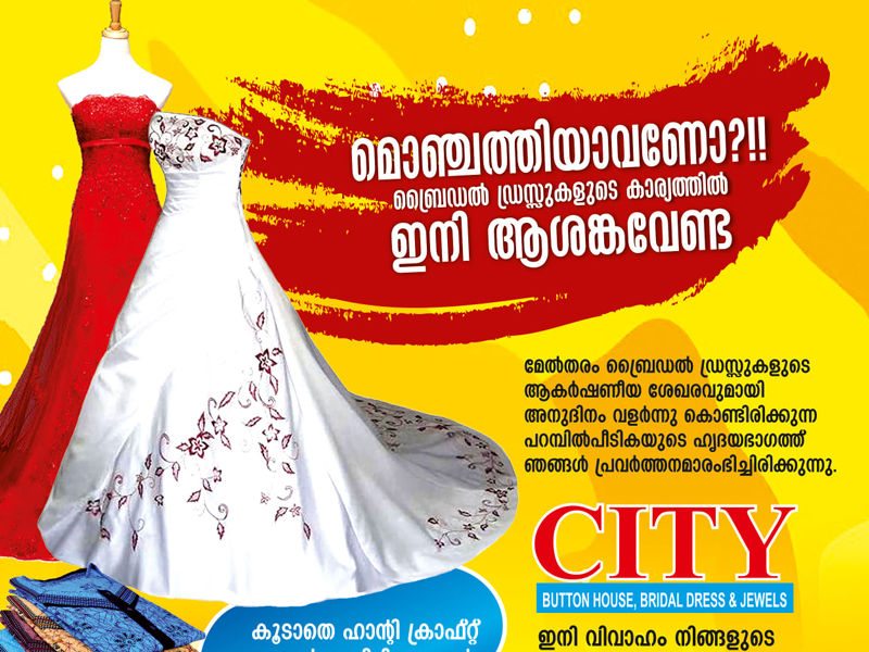
Our archive includes a Malayalam poster for CITY bridal store, an example of a bilingual retail audience being addressed in its own language. You can see more examples in our portfolio.
Layout, grids and white space
A clear layout helps the viewer process information quickly. Even simple posters benefit from an underlying grid that aligns text blocks, images and logos.
- Align elements to shared edges or a centre line. Random placement looks unplanned and is harder to read.
- Group related information, such as date, time and venue, into one block rather than scattering them.
- Leave margins around the edges, especially for print, where trimming and framing can cut close.
- Embrace white space. Empty areas are not wasted; they give the main message room to breathe and make the poster look confident.
- Use a focal image with purpose. One strong photograph or illustration usually beats a collage of small images.
Colour with intent
Colour attracts attention, sets mood and ties the poster to your brand. Start from your brand colours, then add one accent colour for the most important element, such as the offer or call to action. Festival posters often borrow seasonal palettes: floral yellows, oranges and greens for Onam, deep greens and gold for Eid, warm reds for Christmas. Whatever you choose, check that text stays readable against its background, and test how the poster looks in greyscale to confirm the hierarchy works without colour.
A clear call to action
Every poster should tell people what to do next. Make it specific and easy: “Call or WhatsApp 98xx xxxx xx”, “Scan to register”, “Visit us near the bus stand”. Place it where the eye naturally ends its journey, usually the lower part of the poster, and give it enough size to be read. A QR code is useful on printed posters, but only if it is large enough to scan from a sensible distance and leads to a page that works well on mobile.
Preparing print-ready poster files
A great design can still disappoint if the file is not prepared properly for print. Before sending artwork to the printer, check these points. If you prefer, our printing service handles file preparation and production together.
- The document is set up at the final print size, or an exact proportion of it.
- Colours are prepared for print (CMYK) and brand colours have been checked on a printed proof.
- A bleed of about 3 mm is added on all sides for trimmed prints, with important content kept safely inside the margin.
- Images have enough resolution for the viewing distance: around 300 ppi at final size for close-viewed prints; large flex banners seen from far away can often use lower resolution, as confirmed with your printer.
- Fonts are embedded or converted to outlines, so Malayalam and decorative fonts print exactly as designed.
- Phone numbers, dates and spellings have been proofread by at least two people.
- Separate versions are created for each format, rather than stretching one design to fit all.
Adapting one poster for print and social media
Most campaigns now need the same message in several formats: an A3 or A2 print, a large flex board, a square or portrait social media post and a vertical WhatsApp or Instagram story. Each has different proportions and viewing conditions, so plan a flexible design system rather than one fixed layout.
- Print posters can carry slightly more detail because people may stop and read.
- Flex boards need the fewest words and the largest type.
- Feed posts are seen small on phones; keep text minimal and bold.
- Stories and status updates are vertical; keep key text away from the top and bottom edges, where app interface elements appear.
If you plan to promote the poster online with paid reach, our social media promotion team can adapt the artwork and run location-based campaigns around it.
Common poster mistakes to avoid
- Too many messages: five offers of equal size means none of them registers.
- Text over busy photos: headlines placed on a cluttered background become unreadable; use a solid panel or a quieter part of the image.
- Logos competing with the headline: your logo matters, but it rarely needs to be the largest element.
- Stretched or pixelated images: photos pulled from the internet or WhatsApp forwards often print blurry and may not be licensed for use.
- Tiny contact details: a phone number nobody can read from where the poster hangs defeats the purpose.
- Skipping the printed proof: colours on screen can look very different on paper or flex material.
Key takeaways
- Decide on one main message before design begins; everything else supports it.
- Build a clear three-level hierarchy: hook, context, specifics.
- Use contrast in size, colour, weight and space so the message survives a quick glance.
- Limit fonts, size text for viewing distance and give Malayalam text extra room.
- End with a specific call to action and prepare print files with bleed, correct colour and adequate resolution.
- Create tailored versions for print, flex, feed posts and stories.
Frequently Asked Questions
What size should my poster be?
It depends on where it will be displayed. A3 and A2 are common for notice boards and shop windows, while flex banners for shopfronts and roadsides are much larger. Tell your designer where it will go, and the layout can be planned for that size and viewing distance.
How much text is too much on a poster?
If the main message cannot be understood in a few seconds, there is too much. Keep the headline short, group details, and move extra information to a website, brochure or WhatsApp message linked by a QR code.
Can the same design be used for print and Instagram?
The same visual style and message can be used, but each format should be adjusted. Print, flex, square posts and vertical stories have different proportions and viewing conditions, so separate versions work much better than stretching one file.
Should my poster be in Malayalam or English?
Choose the language your audience is most comfortable with. Many local businesses use Malayalam for the headline and English for details such as phone numbers and web addresses, or create two versions for different audiences.
What file should I send to the printer?
A high-resolution PDF at final size with bleed, print-ready colours and embedded or outlined fonts is the safest choice. Always ask your printer for their exact specifications before exporting.
Need a poster that stops people in their tracks and gets your message across in seconds? Dzone Ads designs posters for print, flex and social media, with printing handled in-house. Explore our poster design service or request a quote today.