
Skip to content
Print Design

Magazine and Supplement Layout: Grids, Pacing and Readability

How professional magazine and supplement layouts are built: grids, readable typography, page pacing, bilingual typesetting, flatplans and print-ready preparation.

Magazines, souvenirs and newspaper supplements are some of the most demanding projects in print design. A poster has one message; a 48-page souvenir for an institution’s anniversary might hold messages from dignitaries, history articles, photo spreads, student contributions and sponsor advertisements, often in both Malayalam and English. Without a clear system, the result feels crowded and tiring to read. With a good layout, readers move through the pages comfortably and the publication becomes something people keep. This guide explains the grids, typography and pacing decisions behind professional editorial layouts.

Know your publication before you design

Editorial layout starts with understanding what you are making and who will read it. Typical publications we see from Kerala organisations include:

  • Souvenirs for anniversaries, conferences, arts fests and jubilee celebrations of schools, colleges and religious institutions.
  • Newspaper supplements for events, inaugurations or organisational campaigns, often printed at newspaper size.
  • College and school magazines featuring student writing, art and annual reports.
  • Newsletters and house magazines for businesses, associations and alumni groups.

Each type has different expectations. A souvenir is a keepsake and can be more decorative. A supplement must be quick to scan. A student magazine benefits from energy and variety. Agree on the tone, page count, size, languages and deadline before any page is designed.

Grids: the invisible structure

A grid is a set of guidelines that divides the page into columns, margins and gutters. Readers never see it, but they feel it: pages look orderly, elements line up and the eye knows where to go next.

Margins and gutters

Margins frame the content and protect it from trimming. The inner margin, near the spine, needs extra room so text is not swallowed by the binding, especially in thicker, perfect-bound publications. Gutters, the spaces between columns, must be wide enough that columns read as separate blocks.

Choosing a column structure

GridCharacterBest for
Single columnCalm, book-likeMessages from dignitaries, essays, poetry
Two columnsComfortable and formalArticles in souvenirs and reports
Three columnsFlexible, magazine-likeFeatures mixing text, images and pull quotes
Four to six columns (modular)Dense and dynamicNewspaper supplements, news pages, ad-heavy layouts
Modular grid (columns plus rows)Highly structuredPhoto galleries, directories, event schedules

Many publications use a base grid, for example six or twelve columns, so that pages can switch between two- and three-column layouts while still aligning to the same structure. This keeps variety without losing consistency.

The baseline grid

A baseline grid aligns lines of text across columns and facing pages. When text in neighbouring columns sits on the same lines, pages look polished and print show-through from the reverse side is less distracting.

Typography for long reading

Readers of a magazine are committing time, so body text must be comfortable over many pages.

  • Choose one reliable body typeface per language and use it consistently throughout.
  • Set body text at a size that suits the page and audience; many print magazines use roughly 9 to 11 point, with larger sizes for elderly readers.
  • Give lines enough leading (line spacing), often around 120 to 140 percent of the type size, and more for Malayalam.
  • Keep line length comfortable, roughly 45 to 75 characters per line for English; very wide columns tire the eye.
  • Build a clear heading hierarchy: article title, standfirst or introduction, subheadings, captions and pull quotes, each with its own consistent style.
  • Avoid justified text with large gaps between words; adjust hyphenation and spacing or use left-aligned text.
  • Use paragraph and character styles in your layout software so changes apply consistently across every page.

Malayalam and bilingual typesetting

Bilingual publications are common in Kerala and need particular care. Malayalam script has more vertical detail than Latin script, so it often needs more leading and sometimes a slightly larger size to feel equally readable. Pair Malayalam and English fonts that share a similar weight and colour on the page.

Font encoding matters too. Some traditional DTP workflows used older non-Unicode Malayalam fonts, which can produce broken characters when text is copied between systems or reused online. Working in Unicode where possible makes content easier to edit, proofread and repurpose for websites and social media later. Whatever system you use, keep it consistent and have a fluent reader proofread every page.

Tip: collect all content before layout begins. Late articles, missing photographs and last-minute sponsor ads are the biggest cause of delays and layout compromises. Set a firm content deadline, request text in editable files rather than scanned images or WhatsApp photos of handwritten notes, and ask contributors to send photos at original size.

Pacing: designing the reading journey

Pacing is how a publication feels as you turn the pages. A good magazine alternates rhythm: dense articles are followed by open photo spreads, long features are balanced with short items, and important pages land where readers notice them.

Plan with a flatplan

A flatplan is a miniature map of every page in the publication, laid out in spreads. It shows where each article, photo feature and advertisement will go. Creating it before layout helps you:

  1. Confirm the total page count and that it works for the chosen binding.
  2. Place the most important content, such as the chief guest’s message or the main feature, in prominent positions.
  3. Spread advertisements so they do not cluster at the back or interrupt a feature awkwardly.
  4. Balance text-heavy pages with visual ones.
  5. Give each contributor and sponsor a clear page reference.

Use spreads, not just pages

Readers see two facing pages at once. Design spreads as a unit: a strong image can cross the spine, a headline can sit on one side with the article starting opposite, and facing pages should feel related rather than competing.

Create recurring sections

Consistent section openers, colour codes or icons help readers navigate. For an institutional souvenir, sections might include messages, history, departments, achievements, alumni, student contributions and sponsors, each with a recognisable opening page.

Our archive includes a unit supplement designed for SKSSF Muttipalam, an example of how a community organisation can present its activities in a structured print format. More editorial and brochure work is in our portfolio.
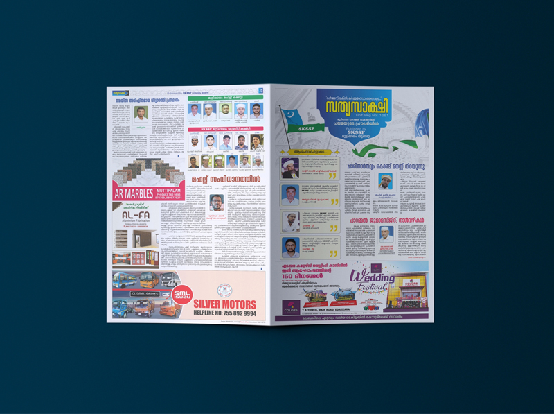
SKSSF Muttipalam newspaper supplement layout by Dzone Ads

Page furniture: the details that make it professional

“Page furniture” refers to the recurring elements that help readers find their way. They are small, but they separate amateur layouts from professional ones.

  • Folios: page numbers, usually with the publication name or section.
  • Running heads: section names at the top of pages.
  • Bylines and author details: consistent placement and style for every article.
  • Captions: every meaningful photo should have one, with names spelled correctly.
  • Pull quotes: short highlighted lines that break up long text and invite browsing.
  • Contents page: clear and accurate, updated after final pagination.

Advertisements and sponsor pages

Souvenirs and supplements are often funded by sponsors, so advertisements need fair, organised treatment. Define standard ad sizes, such as full page, half page and quarter page, and share exact dimensions with advertisers early. Collect ads as print-ready files where possible, or plan time to design them. Place ads so they respect editorial content; facing a related article or grouped by size usually looks best.

Multi-page printing has its own technical rules. Discuss these with your printer at the start, not at the end. Dzone Ads offers printing works alongside layout, which helps align these decisions early.

DecisionWhat to know
Page countSaddle-stitched (stapled) publications need page counts in multiples of four; many presses print in larger sections, so ask which counts are most economical
BindingSaddle stitching suits thinner publications; perfect binding with a flat spine suits thicker souvenirs
PaperHeavier cover stock, lighter inner pages; matte for reading comfort, gloss for photo-heavy sections
Bleed and safe areaAdd bleed for images that run to the edge and keep text away from trim and spine
ImagesHigh-resolution photos at final size, converted correctly for print colour
ProofsCheck a full printed proof or digital proof page by page before the final run

A realistic production timeline

For a typical souvenir or supplement, plan backwards from the release date. A workable sequence looks like this:

  1. Content collection: articles, messages, photographs, sponsor ads and the list of committee members or contributors.
  2. Flatplan and templates: page count, section order, grid, type styles and a cover concept for approval.
  3. Full layout: placing every page, sizing photos and fitting text to the space available.
  4. Proofreading rounds: at least two, with corrections marked clearly on a single shared PDF rather than scattered across WhatsApp messages.
  5. Final approval and print files: a responsible person signs off every page before files go to press.
  6. Printing and binding: the time needed depends on quantity, paper and binding method.

Thicker publications and those with many sponsors usually need more time, so starting several weeks ahead of the event is wise. Nominating one coordinator from your organisation to collect content and approve changes also speeds things up considerably.

Key takeaways

  • Define the publication type, audience, size, languages and page count before design starts.
  • Use a consistent grid with sensible margins, gutters and a baseline grid for orderly pages.
  • Set body text for comfortable reading, with extra leading for Malayalam and consistent styles throughout.
  • Plan pacing with a flatplan, design spreads as units and balance dense and visual pages.
  • Treat sponsor ads fairly with standard sizes and thoughtful placement.
  • Agree page count, binding, paper and proofing with your printer from the beginning.

Frequently Asked Questions

How many pages should our souvenir have?

It depends on your content and budget. Start by listing every article, message, photo section and ad, then estimate pages for each. Your printer will advise on page counts that work for the binding and are economical to print.

Can you design a magazine in both Malayalam and English?

Yes. Bilingual layouts are planned so both languages have consistent styles, comfortable spacing and matching hierarchy. Careful proofreading by fluent readers is part of the process.

What format should we send our articles in?

Editable text files are best, such as Word or Google Docs. Scanned pages or photos of handwritten text need retyping, which adds time and the risk of errors.

What is the difference between a brochure and a magazine layout?

A brochure is usually a short promotional piece focused on one organisation or offer; see our brochure design service for that. A magazine or souvenir holds many articles and contributors and needs a stronger system of grids, styles and navigation.

Can the printed magazine be shared digitally too?

Yes. A digital PDF version can be prepared for sharing on WhatsApp, email or your website, and articles can be repurposed for social media, especially when the text is set in Unicode.

Planning a souvenir, supplement or magazine? Dzone Ads can handle the layout, typesetting and printing from first flatplan to finished copies. See our magazine and supplement layout service or contact us to discuss your publication.
Written by the Dzone Ads Team

Designers, developers and marketers from Malappuram, Kerala, sharing what we learn while building brands, websites and campaigns for our clients. About us

Leave a comment

Your email address will not be published. Required fields are marked *

Keep reading

Related articles

Print Design

Magazine and Supplement Layout: Grids, Pacing and Readability

How professional magazine and supplement layouts are built: grids, readable typography, page pacing, bilingual typesetting, flatplans and print-ready preparation.

Magazines, souvenirs and newspaper supplements are some of the most demanding projects in print design. A poster has one message; a 48-page souvenir for an institution’s anniversary might hold messages from dignitaries, history articles, photo spreads, student contributions and sponsor advertisements, often in both Malayalam and English. Without a clear system, the result feels crowded and tiring to read. With a good layout, readers move through the pages comfortably and the publication becomes something people keep. This guide explains the grids, typography and pacing decisions behind professional editorial layouts.

Know your publication before you design

Editorial layout starts with understanding what you are making and who will read it. Typical publications we see from Kerala organisations include:

  • Souvenirs for anniversaries, conferences, arts fests and jubilee celebrations of schools, colleges and religious institutions.
  • Newspaper supplements for events, inaugurations or organisational campaigns, often printed at newspaper size.
  • College and school magazines featuring student writing, art and annual reports.
  • Newsletters and house magazines for businesses, associations and alumni groups.

Each type has different expectations. A souvenir is a keepsake and can be more decorative. A supplement must be quick to scan. A student magazine benefits from energy and variety. Agree on the tone, page count, size, languages and deadline before any page is designed.

Grids: the invisible structure

A grid is a set of guidelines that divides the page into columns, margins and gutters. Readers never see it, but they feel it: pages look orderly, elements line up and the eye knows where to go next.

Margins and gutters

Margins frame the content and protect it from trimming. The inner margin, near the spine, needs extra room so text is not swallowed by the binding, especially in thicker, perfect-bound publications. Gutters, the spaces between columns, must be wide enough that columns read as separate blocks.

Choosing a column structure

GridCharacterBest for
Single columnCalm, book-likeMessages from dignitaries, essays, poetry
Two columnsComfortable and formalArticles in souvenirs and reports
Three columnsFlexible, magazine-likeFeatures mixing text, images and pull quotes
Four to six columns (modular)Dense and dynamicNewspaper supplements, news pages, ad-heavy layouts
Modular grid (columns plus rows)Highly structuredPhoto galleries, directories, event schedules

Many publications use a base grid, for example six or twelve columns, so that pages can switch between two- and three-column layouts while still aligning to the same structure. This keeps variety without losing consistency.

The baseline grid

A baseline grid aligns lines of text across columns and facing pages. When text in neighbouring columns sits on the same lines, pages look polished and print show-through from the reverse side is less distracting.

Typography for long reading

Readers of a magazine are committing time, so body text must be comfortable over many pages.

  • Choose one reliable body typeface per language and use it consistently throughout.
  • Set body text at a size that suits the page and audience; many print magazines use roughly 9 to 11 point, with larger sizes for elderly readers.
  • Give lines enough leading (line spacing), often around 120 to 140 percent of the type size, and more for Malayalam.
  • Keep line length comfortable, roughly 45 to 75 characters per line for English; very wide columns tire the eye.
  • Build a clear heading hierarchy: article title, standfirst or introduction, subheadings, captions and pull quotes, each with its own consistent style.
  • Avoid justified text with large gaps between words; adjust hyphenation and spacing or use left-aligned text.
  • Use paragraph and character styles in your layout software so changes apply consistently across every page.

Malayalam and bilingual typesetting

Bilingual publications are common in Kerala and need particular care. Malayalam script has more vertical detail than Latin script, so it often needs more leading and sometimes a slightly larger size to feel equally readable. Pair Malayalam and English fonts that share a similar weight and colour on the page.

Font encoding matters too. Some traditional DTP workflows used older non-Unicode Malayalam fonts, which can produce broken characters when text is copied between systems or reused online. Working in Unicode where possible makes content easier to edit, proofread and repurpose for websites and social media later. Whatever system you use, keep it consistent and have a fluent reader proofread every page.

Tip: collect all content before layout begins. Late articles, missing photographs and last-minute sponsor ads are the biggest cause of delays and layout compromises. Set a firm content deadline, request text in editable files rather than scanned images or WhatsApp photos of handwritten notes, and ask contributors to send photos at original size.

Pacing: designing the reading journey

Pacing is how a publication feels as you turn the pages. A good magazine alternates rhythm: dense articles are followed by open photo spreads, long features are balanced with short items, and important pages land where readers notice them.

Plan with a flatplan

A flatplan is a miniature map of every page in the publication, laid out in spreads. It shows where each article, photo feature and advertisement will go. Creating it before layout helps you:

  1. Confirm the total page count and that it works for the chosen binding.
  2. Place the most important content, such as the chief guest’s message or the main feature, in prominent positions.
  3. Spread advertisements so they do not cluster at the back or interrupt a feature awkwardly.
  4. Balance text-heavy pages with visual ones.
  5. Give each contributor and sponsor a clear page reference.

Use spreads, not just pages

Readers see two facing pages at once. Design spreads as a unit: a strong image can cross the spine, a headline can sit on one side with the article starting opposite, and facing pages should feel related rather than competing.

Create recurring sections

Consistent section openers, colour codes or icons help readers navigate. For an institutional souvenir, sections might include messages, history, departments, achievements, alumni, student contributions and sponsors, each with a recognisable opening page.

Our archive includes a unit supplement designed for SKSSF Muttipalam, an example of how a community organisation can present its activities in a structured print format. More editorial and brochure work is in our portfolio.

SKSSF Muttipalam newspaper supplement layout by Dzone Ads

Page furniture: the details that make it professional

“Page furniture” refers to the recurring elements that help readers find their way. They are small, but they separate amateur layouts from professional ones.

  • Folios: page numbers, usually with the publication name or section.
  • Running heads: section names at the top of pages.
  • Bylines and author details: consistent placement and style for every article.
  • Captions: every meaningful photo should have one, with names spelled correctly.
  • Pull quotes: short highlighted lines that break up long text and invite browsing.
  • Contents page: clear and accurate, updated after final pagination.

Advertisements and sponsor pages

Souvenirs and supplements are often funded by sponsors, so advertisements need fair, organised treatment. Define standard ad sizes, such as full page, half page and quarter page, and share exact dimensions with advertisers early. Collect ads as print-ready files where possible, or plan time to design them. Place ads so they respect editorial content; facing a related article or grouped by size usually looks best.

Multi-page printing has its own technical rules. Discuss these with your printer at the start, not at the end. Dzone Ads offers printing works alongside layout, which helps align these decisions early.

DecisionWhat to know
Page countSaddle-stitched (stapled) publications need page counts in multiples of four; many presses print in larger sections, so ask which counts are most economical
BindingSaddle stitching suits thinner publications; perfect binding with a flat spine suits thicker souvenirs
PaperHeavier cover stock, lighter inner pages; matte for reading comfort, gloss for photo-heavy sections
Bleed and safe areaAdd bleed for images that run to the edge and keep text away from trim and spine
ImagesHigh-resolution photos at final size, converted correctly for print colour
ProofsCheck a full printed proof or digital proof page by page before the final run

A realistic production timeline

For a typical souvenir or supplement, plan backwards from the release date. A workable sequence looks like this:

  1. Content collection: articles, messages, photographs, sponsor ads and the list of committee members or contributors.
  2. Flatplan and templates: page count, section order, grid, type styles and a cover concept for approval.
  3. Full layout: placing every page, sizing photos and fitting text to the space available.
  4. Proofreading rounds: at least two, with corrections marked clearly on a single shared PDF rather than scattered across WhatsApp messages.
  5. Final approval and print files: a responsible person signs off every page before files go to press.
  6. Printing and binding: the time needed depends on quantity, paper and binding method.

Thicker publications and those with many sponsors usually need more time, so starting several weeks ahead of the event is wise. Nominating one coordinator from your organisation to collect content and approve changes also speeds things up considerably.

Key takeaways

  • Define the publication type, audience, size, languages and page count before design starts.
  • Use a consistent grid with sensible margins, gutters and a baseline grid for orderly pages.
  • Set body text for comfortable reading, with extra leading for Malayalam and consistent styles throughout.
  • Plan pacing with a flatplan, design spreads as units and balance dense and visual pages.
  • Treat sponsor ads fairly with standard sizes and thoughtful placement.
  • Agree page count, binding, paper and proofing with your printer from the beginning.

Frequently Asked Questions

How many pages should our souvenir have?

It depends on your content and budget. Start by listing every article, message, photo section and ad, then estimate pages for each. Your printer will advise on page counts that work for the binding and are economical to print.

Can you design a magazine in both Malayalam and English?

Yes. Bilingual layouts are planned so both languages have consistent styles, comfortable spacing and matching hierarchy. Careful proofreading by fluent readers is part of the process.

What format should we send our articles in?

Editable text files are best, such as Word or Google Docs. Scanned pages or photos of handwritten text need retyping, which adds time and the risk of errors.

What is the difference between a brochure and a magazine layout?

A brochure is usually a short promotional piece focused on one organisation or offer; see our brochure design service for that. A magazine or souvenir holds many articles and contributors and needs a stronger system of grids, styles and navigation.

Can the printed magazine be shared digitally too?

Yes. A digital PDF version can be prepared for sharing on WhatsApp, email or your website, and articles can be repurposed for social media, especially when the text is set in Unicode.

Planning a souvenir, supplement or magazine? Dzone Ads can handle the layout, typesetting and printing from first flatplan to finished copies. See our magazine and supplement layout service or contact us to discuss your publication.
Written by the Dzone Ads Team

Designers, developers and marketers from Malappuram, Kerala, sharing what we learn while building brands, websites and campaigns for our clients. About us

Leave a comment

Your email address will not be published. Required fields are marked *

Keep reading

Related articles

Ready to grow your brand?

We are always happy to stand with you in every step to your satisfaction. Tell us about your idea — we reply within one working day.