
Colour is often the first thing people notice about a brand — before they read your name, understand your logo or look at your prices. Walk down any busy market road in Kerala and you will recognise certain shops from a distance simply by their signboard colours. That is the power of colour in branding: it creates instant recognition and quietly shapes how people feel about a business. But choosing brand colours is not just about picking your favourite shade. This guide explains how colour psychology in branding works, what common colours tend to suggest, how culture changes their meaning, and a practical method to choose a palette that truly fits your business.
What Is Colour Psychology in Branding?
Colour psychology is the study of how colours influence perception, emotion and behaviour. In branding, it is about using colour deliberately so that your visual identity supports the personality and promise of your business. A children’s toy store and a law firm communicate very different things, and colour is one of the fastest ways to signal that difference.
It is important to be realistic: colour does not work like magic. The same colour can feel different depending on its shade, the colours around it, the industry and the viewer’s culture and personal experience. What colour psychology offers is a set of useful tendencies — a starting point for thoughtful decisions, not a strict rulebook.
- Colour builds recognition — people remember colours faster than names.
- It sets the emotional tone — calm, energetic, premium, friendly or trustworthy.
- It helps you stand apart from competitors in the same street or category.
- It creates consistency across signboards, packaging, websites and social media.
- It guides attention — for example, to a “Call now” or “WhatsApp us” button.
What Common Colours Tend to Communicate
Here is a practical reference for the associations people commonly have with major colours, along with how they are often used in business. Remember that shade matters: a soft pastel and a deep, saturated version of the same colour can feel completely different.
| Colour | Common associations | Often used by | Use with care |
|---|---|---|---|
| Red | Energy, passion, urgency, appetite, celebration | Food, retail sales, entertainment, festive brands | Can feel aggressive or alarming if overused |
| Orange | Friendliness, enthusiasm, affordability, creativity | Food delivery, youth brands, budget-friendly retail | May look less premium in some shades |
| Yellow | Optimism, warmth, attention, cheerfulness | Children’s brands, signage, offers | Hard to read as text on white backgrounds |
| Green | Nature, growth, health, freshness, harmony | Agriculture, organic food, healthcare, eco brands | Very common in some categories; choose a distinctive shade |
| Blue | Trust, calm, reliability, professionalism | Banks, tech, healthcare, education, corporate services | Can feel cold or generic without a distinctive accent |
| Purple | Luxury, creativity, imagination, spirituality | Beauty, wellness, premium and creative brands | Some shades can feel artificial |
| Pink | Care, romance, playfulness, softness | Beauty, bakery, fashion, gifting | Can narrow perceived audience if used heavily |
| Brown | Earthiness, reliability, warmth, tradition | Coffee, furniture, leather, construction | Can look dull without good contrast |
| Black | Sophistication, power, elegance, modernity | Luxury, fashion, technology, premium products | Too much can feel heavy or severe |
| White | Simplicity, purity, cleanliness, space | Healthcare, minimal brands, bridal | Needs a strong accent colour to stay memorable |
| Gold | Prestige, celebration, tradition, value | Jewellery, weddings, premium and festive brands | Flat yellow-gold can look cheap; consider foil or metallic print |
Culture and Context: Colour in India and Kerala
Colour meanings are strongly shaped by culture. Many associations common in Western branding guides do not translate directly to Indian audiences, so it pays to think locally.
- White and gold are deeply familiar in Kerala through the traditional kasavu saree and mundu, and are widely associated with Onam, weddings and festive elegance.
- Red is a colour of celebration and auspicious occasions for many communities in India, including weddings.
- Green evokes Kerala’s landscape — paddy fields, coconut groves and backwaters — and naturally suits agriculture, Ayurveda, organic products and nursery businesses. It also holds special significance in Islamic tradition, which is relevant for many institutions and organisations.
- Saffron, yellow and orange carry festive and spiritual associations for many Indians.
If your customers include the Gulf diaspora or international clients, consider how your palette reads in those markets too. The safest approach is simple: know your audience, and test your colours with real people from it.
How to Choose Your Brand Palette: Step by Step
Step 1: Define Your Brand Personality
Write down three to five words that describe how you want customers to feel about your business — for example, “trustworthy, calm, expert” for a clinic, or “fun, fresh, affordable” for a juice shop. These words become your filter for every colour decision.
Step 2: Study Your Competitors
Collect logos, signboards and social media pages of businesses in your category and area. If every pharmacy nearby uses green and every bank uses blue, a well-chosen alternative can help you stand out — as long as it still fits your industry’s expectations of trust and quality.
Step 3: Choose a Primary Colour
Your primary colour is the one people should associate with you. It appears in your logo, signboard and key brand moments. Choose it based on your personality words, your audience and how distinctive it is in your market.
Step 4: Add Secondary and Accent Colours
Most strong palettes have one primary colour, one or two secondary colours that complement it, and an accent colour for highlights like buttons and offers. Add neutrals — white, off-white, greys or a dark tone — for backgrounds and text.
Step 5: Apply the 60-30-10 Rule
A helpful guideline borrowed from interior design: use your dominant colour (often a neutral or your primary) for around 60% of a design, a secondary colour for about 30%, and an accent for about 10%. This creates balance and stops designs from feeling chaotic.

Step 6: Check Contrast and Readability
Colour must work for reading, not just for looks. Text needs enough contrast against its background to be readable in bright sunlight, on low-quality phone screens and for people with visual impairments. Web accessibility guidelines recommend a contrast ratio of at least 4.5:1 for normal body text. Remember too that some people have colour vision deficiency, so never rely on colour alone to communicate important information.
Step 7: Test in Real-World Situations
Before finalising, test your palette across everything you will actually use:
- A signboard mock-up viewed from a distance and in daylight.
- A social media post and a WhatsApp profile picture on a phone screen.
- A printed visiting card, letterpad and brochure sample.
- Your logo in one colour and in black and white.
- Your website buttons, headings and backgrounds.
- A grayscale version — does the design still have clear contrast?
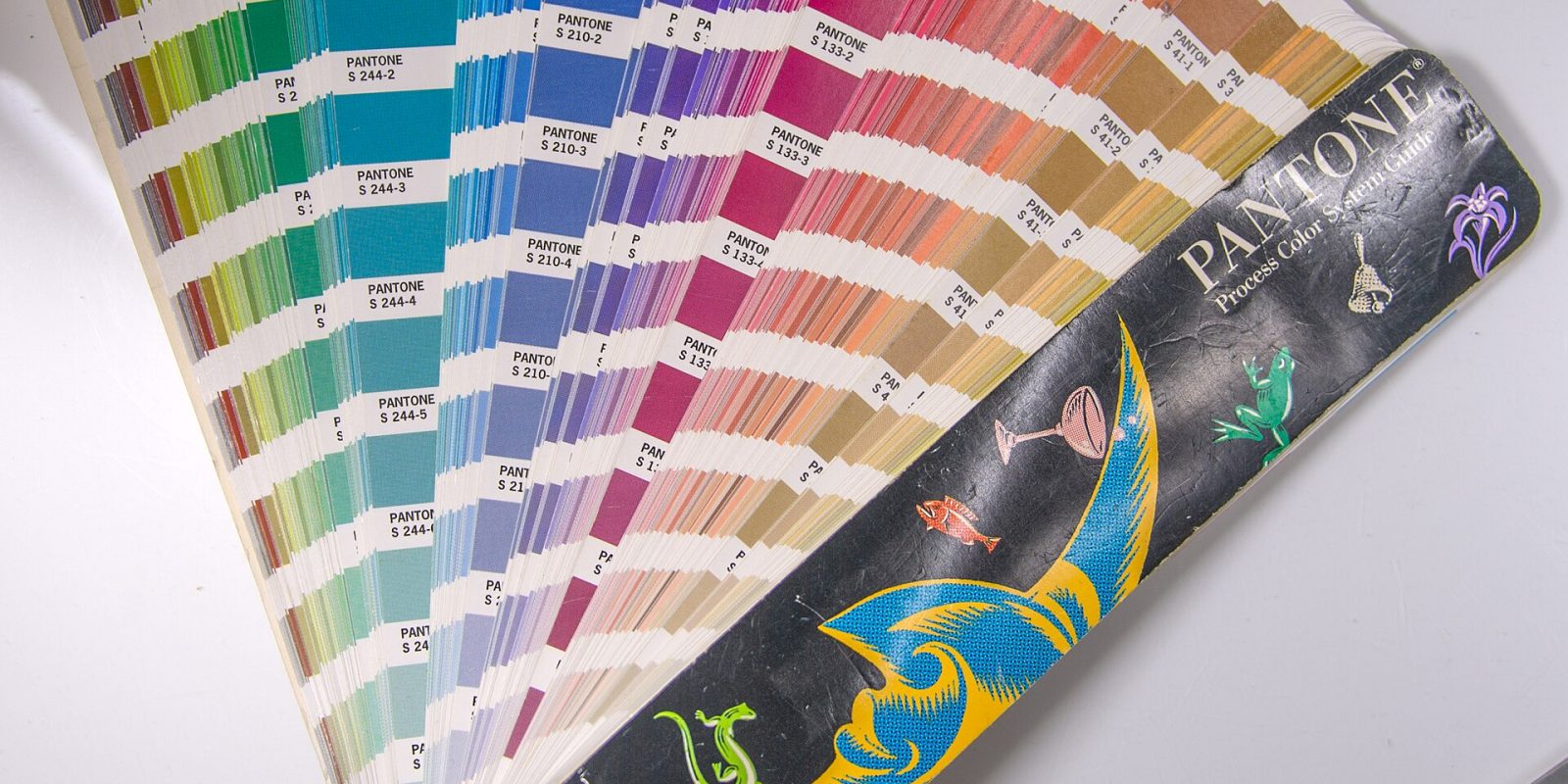
Tip: Colours look different on screen and in print. Screens use RGB light, while printers use CMYK inks, so a bright on-screen blue or green may print duller. Always define your colours in HEX/RGB for digital, CMYK for print, and consider a Pantone reference for critical items. Ask your printer for a printed proof before large print runs.
Palette Ideas by Business Type
These are starting points to discuss with your designer, not fixed formulas:
- Clinic or pharmacy: calm blues or fresh greens with plenty of white, plus a warm accent so the brand feels caring rather than clinical.
- Restaurant or bakery: warm reds, oranges or browns that suggest flavour and comfort, balanced with a cream or off-white neutral.
- Educational institution: deep blue, maroon or green for stability and seriousness, with gold or a bright accent for achievement and events.
- Bridal store or wedding services: ivory, gold, maroon or soft blush tones that feel festive and elegant.
- Agricultural nursery or organic store: natural greens and earthy browns, with a fresh yellow or leaf-light accent.
Document Your Palette
Once you have decided, record your colours in a simple brand sheet so everyone — designers, printers, sign makers and your own team — uses exactly the same shades. Include:
- Colour names (for example, “Leaf Green”, “Sand Beige”).
- HEX and RGB codes for websites and social media.
- CMYK values for print, and Pantone references if used.
- Rules for which colour is used where — backgrounds, headings, buttons, offers.
- Approved colour combinations and ones to avoid.
A short brand sheet is especially useful during busy festival seasons, when posters, banners and social posts are created quickly — sometimes by different people. It keeps your Onam poster, your Eid offer and your Christmas post looking like one brand.
Common Colour Mistakes in Branding
- Choosing only by personal taste instead of brand personality and audience.
- Using too many colours, which makes the brand feel scattered and hard to remember.
- Copying a competitor’s colours, making it harder for customers to tell you apart.
- Ignoring contrast, resulting in text that is hard to read.
- Changing colours often, which throws away recognition you have built.
- Forgetting print, so colours that look vibrant on screen appear muddy on paper.
Bringing Colour Into Your Whole Identity
Your palette works best alongside a strong logo and consistent typography. When we develop a logo at Dzone Ads, colour choices are tested on screens and printed materials so they hold up everywhere. The same palette then flows into web design, social media templates, posters and print. For tips on choosing fonts that match your colours, read our typography guide on the blog.
Key takeaways
- Colour shapes first impressions and builds recognition faster than words.
- Colour associations are tendencies, not rules — shade, context and culture all matter.
- In India and Kerala, colours like white, gold, red and green carry strong cultural meaning.
- Build a palette with one primary, one or two secondary colours, an accent and neutrals.
- Check contrast for readability and test colours on screen and in print.
- Document HEX, RGB, CMYK and usage rules so your brand stays consistent.
Frequently Asked Questions
How many colours should a brand palette have?
Most effective brands use one primary colour, one or two secondary colours and an accent, plus neutrals for text and backgrounds. Fewer colours make your brand easier to recognise and simpler to apply consistently.
Does colour really affect buying decisions?
Colour influences first impressions, recognition and the emotional tone of a brand, which can affect how customers feel about buying. However, it works together with quality, price, service and messaging — it is not a shortcut on its own.
Should my brand colours match my industry?
Your colours should feel appropriate for your industry so customers trust you, but they should also help you stand out. Often the best choice is a familiar colour family in a distinctive shade, or a fresh accent colour.
Why do my colours look different in print?
Screens display colour using light (RGB), while printers use inks (CMYK), which cannot reproduce every bright screen colour. Using proper CMYK values and checking printed proofs helps keep colours consistent.
Can I change my brand colours later?
Yes, but do it carefully. Changing colours resets some of the recognition you have built. If you need a refresh, consider adjusting shades or adding a new accent rather than replacing your entire palette.
Not sure which colours suit your business? Let Dzone Ads help you build a palette that fits your brand and works everywhere from signboards to Instagram. Get a free quote for your branding project today.