We see dozens of logos every day — on shop boards, delivery bags, WhatsApp profile pictures, school uniforms and the apps on our phones. Most of them we never notice. A few we recognise instantly, even from across a busy road. So is a logo really essential for an entrepreneur, or just something nice to have? If you are starting or growing a business, you have probably asked yourself this. The honest answer: a logo will not run your business for you, but a good one quietly works for you every single day. This guide explains what makes a creative logo genuinely effective, with 12 principles you can use to judge any design — including your own.
Why a Logo Matters More Than You Think
A logo is the face of your business. Before customers read your price list or visit your website, they see your mark and form an impression: professional or careless, premium or budget. A well-made logo does not need to explain everything you do. Its job is to be recognised, remembered and trusted.
For small businesses in Kerala and across India, this matters even more. You are competing with a crowded market where many shops sell similar products. A consistent, clear logo on your signboard, visiting cards, carry bags, Instagram page and invoices makes you look established — even if you opened last month.
- It builds instant recognition across every touchpoint.
- It signals professionalism and makes customers more comfortable paying you.
- It separates you from competitors who sell similar things.
- It becomes the anchor for your whole brand identity — colours, fonts and style.
- It grows in value over time as people associate it with good experiences.
The 12 Principles of Memorable Logo Design
There is no single formula for a great logo, but strong logos tend to share the same qualities. Use these 12 principles as a checklist whether you are briefing a designer or reviewing concepts.
1. Keep It Simple
Simplicity is the most important principle. A simple logo is easier to recognise, easier to remember and easier to reproduce. If your logo needs a paragraph to explain, it is probably too complicated. Remove anything that does not add meaning.
2. Make It Memorable
Memorable logos usually have one distinctive idea: a clever negative space, an unusual letter shape, a strong symbol. Ask yourself, “Could a customer describe this logo to a friend over the phone?” If the answer is yes, you are on the right track.
3. Design for Relevance
Your logo should feel right for your industry and audience. A children’s play school, a legal consultancy and a biryani restaurant need very different personalities. Relevance does not mean being literal — a bakery logo does not have to show a loaf of bread — but the style, colour and tone should match what customers expect from a business like yours, while still standing out.
4. Aim for Timelessness
Trends come and go. Gradients, 3D effects and certain fonts can look dated within a few years. A good logo should still feel right in ten years. Let your marketing materials carry the trendy elements instead.
5. Ensure Versatility
Your logo will appear in places you may not expect: a rubber seal, an embroidered shirt, a mug, a tiny social media icon, a large flex board, a printed bill book. A versatile logo works in all of these. That means it needs to look good in one colour, in black and white, on dark and light backgrounds, and in both horizontal and stacked layouts.
6. Test Scalability
Shrink your logo down to the size of a favicon (about 16–32 pixels) and enlarge it to fill a hoarding. Does it still work? Fine lines, tiny text and intricate details disappear when small and can look clumsy when huge. Strong logos have a clear silhouette at every size.
7. Use Colour With Purpose
Colour carries emotion and meaning, but a logo should never depend on colour alone. Design in black and white first, then add colour. Limit your palette to one or two main colours so the logo stays clean and printing stays affordable. You will find a detailed guide to colour psychology in branding on the Dzone Ads blog.
8. Choose Typography Carefully
If your logo includes your business name, the font is half the design. Avoid overused default fonts and overly decorative scripts that are hard to read. Often the best wordmarks are customised — letters adjusted, spacing refined, a small detail added — so they feel unique rather than typed.
9. Be Distinctive, Not Derivative
It is tempting to copy the style of a famous brand or a competitor you admire. Resist it. A logo that looks like someone else’s confuses customers and can even cause legal trouble.
10. Plan for Bilingual Use
Many Kerala businesses communicate in both Malayalam and English. If your signboard, posters or packaging will carry Malayalam text, plan for it from the start. A logo can have an English and a Malayalam version that share the same symbol, proportions and spirit. The letterforms need to feel like a family, not two unrelated designs placed side by side. Arabic calligraphy is another rich tradition here — our calligraphic logo for the Darimees Central Council is one example of how script itself can become the mark.
11. Tell a Story — Quietly
The best logos often hide a meaning that customers discover over time: an initial shaped like a leaf, a roof formed by two letters, a symbol that hints at the founder’s hometown. A story makes the logo more meaningful to you and more interesting to share.
12. Stay Consistent
Even a brilliant logo loses power if it is used differently everywhere — stretched on one poster, recoloured on another, placed on a busy photo on a third. Consistency is what turns a mark into a brand. Create simple usage rules and stick to them.
Types of Logos: Which One Suits Your Business?
Before sketching, decide which type of logo fits your name, budget and plans. Each type has strengths and trade-offs.
| Logo type | What it is | Best for | Watch out for |
|---|---|---|---|
| Wordmark | The business name in a distinctive typeface | Short, unique names | Long names become hard to read when small |
| Lettermark / monogram | Initials or a single letter | Long names, institutions, family businesses | Initials alone may mean nothing to new customers at first |
| Pictorial mark | A recognisable icon or symbol | Businesses with a clear visual idea | Too literal icons can feel generic |
| Abstract mark | A unique geometric or abstract shape | Brands that want a modern, flexible identity | Needs time and consistency to build meaning |
| Emblem / badge | Text inside a shape, seal or crest | Schools, colleges, associations, heritage brands | Detail can be lost at small sizes |
| Combination mark | Symbol plus wordmark used together or separately | Most small businesses | Both parts must work on their own too |
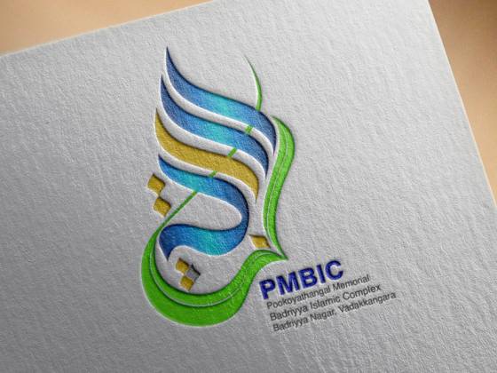
Educational institutions often prefer emblems because they convey tradition and authority. Logos we have designed for organisations such as PMBIC (Pookoyathangal Memorial Badriyya Islamic Complex, Vadakkangara), PMST Arts & Science College in Kundoor and ZAMZAM Islamic Boys HSS in Kondotty reflect this kind of requirement. Retail shops and service businesses, on the other hand, usually benefit from a combination mark that works on a signboard and as a small social media icon.
A Simple Logo Design Process That Works
Good logos rarely appear in a flash of inspiration. They come from a clear process. Here is the approach we recommend — and broadly follow at Dzone Ads — for small businesses. You can read more about our working steps on the How We Work page.
- Brief: Write down your business name, what you sell, who your customers are, three words that describe your personality, and where the logo will be used most.
- Research: Look at competitors and your industry. Note common colours and styles so you can stand apart.
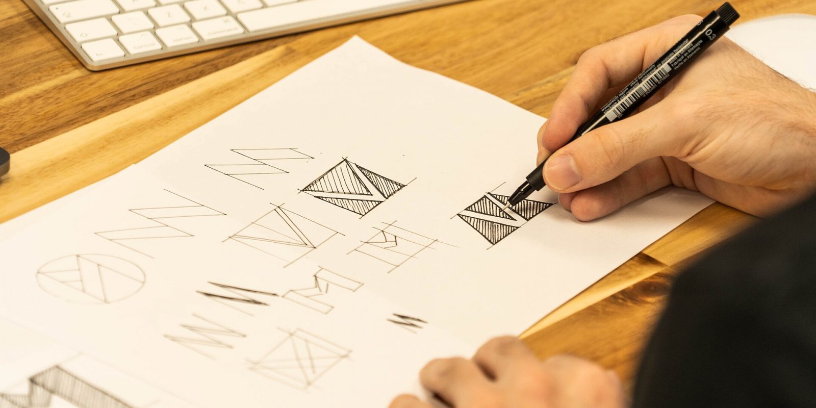
- Sketch: Explore many rough ideas on paper. Quantity first, quality later.
- Digital concepts: Develop the strongest two or three ideas in vector software, in black and white first.
- Feedback: Review concepts against the 12 principles, not just personal taste. Show them to a few real customers if possible.
- Refine: Adjust spacing, weight, curves and colour. Small refinements make a big difference.
- Test: Mock up the logo on a visiting card, signboard, WhatsApp profile picture and a printed letterhead.
- Deliver: Receive final files in all the formats you need, plus simple usage guidelines.
Tip: Always ask for your logo as vector files (AI, EPS, SVG or PDF) as well as PNG and JPG. Local print shops, flex printers and embroidery units will ask for a “high-resolution” or “open” file. Having vector files ready saves you time and avoids blurry prints during busy seasons like Onam, Eid or wedding season, when every printer is rushing.
Common Logo Mistakes Small Businesses Make
Most weak logos are not the result of a lack of talent. They come from rushed decisions. Watch out for these common mistakes:
- Using clip art or free templates. They are cheap, but thousands of other businesses may use the same image, and you cannot truly own it.
- Cramming in too many ideas. A logo for a restaurant does not need a plate, a spoon, a chef’s hat, a chilli and a coconut tree all at once.
- Choosing hard-to-read fonts. Decorative scripts look elegant on screen but often fail on a signboard viewed from a moving vehicle.
- Relying on effects. Shadows, glows and gradients often break when printed in one colour or on a rubber seal.
- Designing only for screen. Remember print: bill books, seals, envelopes and letterpads are still used every day by most businesses.
- Changing the logo too often. Frequent redesigns throw away the recognition you have built. Refine gradually instead.
How to Brief a Logo Designer
A clear brief is the single biggest factor in getting a logo you love. Whether you work with Dzone Ads or another designer, prepare answers to these questions before your first conversation:
- What is the exact business name and spelling, including any tagline?
- What do you sell, and what makes you different from others nearby?
- Who are your ideal customers — age, location, language, income level?
- Which three to five words describe your brand personality?
- Are there colours you love, or colours you must avoid?
- Do you need Malayalam, Arabic or Hindi versions alongside English?
- Where will the logo appear most — signboard, packaging, website, vehicles, uniforms?
- Which logos do you like, and why? Which do you dislike?
Sharing these answers over WhatsApp or email before your first meeting makes feedback rounds faster and more focused.
How Much Does a Logo Cost?
Logo pricing varies widely, from very cheap online templates to large agency branding projects. The price usually depends on the number of initial concepts, rounds of revision, research involved, and whether you need extra items such as a brand guide, stationery or bilingual versions. At Dzone Ads, logo design starts from ₹2,999, and the final quote depends on the scope of your project. You can see what is typically included on our pricing page or explore our logo creation service for details.
Once your logo is ready, the natural next step is applying it consistently — on business cards, letterpads, social media templates and signage — so customers see the same identity wherever they meet you.
Key takeaways
- A logo is the face of your business; it builds recognition and trust over time.
- Simplicity, memorability, relevance and timelessness are the foundations of good logo design.
- Test your logo at very small and very large sizes, in one colour and on dark backgrounds.
- Plan bilingual versions early if you communicate in Malayalam, Arabic or other languages.
- Choose the logo type — wordmark, emblem, combination mark — that suits your name and usage.
- Always collect vector files, colour codes and font names when the project ends.
Frequently Asked Questions
Does a small business really need a professional logo?
Yes, if you want customers to remember and trust you. A professional logo makes your shop, page or service look established and helps people recognise you on signboards, social media and printed materials. It does not need to be expensive, but it should be original and usable everywhere.
How long does it take to design a logo?
It depends on the scope and how quickly feedback is shared. A straightforward logo for a small business can often be completed within days to a couple of weeks, including revisions. Complex identities with research and multiple language versions take longer.
Should my logo include Malayalam text?
If most of your customers read Malayalam or your signboards are mainly in Malayalam, a Malayalam version is a smart idea. Many businesses use an English primary logo with a matching Malayalam version that shares the same symbol and style, so both feel like one brand.
What file formats do I need for printing?
Ask for vector formats such as AI, EPS, SVG or PDF for printing, plus high-resolution PNG files with transparent backgrounds for digital use. Printers, flex units and embroidery shops usually need vector files to produce sharp results.
Can I redesign my existing logo instead of starting from scratch?
Yes. If customers already recognise your logo, a refresh that keeps its core idea while improving simplicity, legibility and versatility is often better than a complete change. A designer can modernise it without losing the recognition you have built.
Ready to create a logo that people remember? Tell us about your business and we will suggest the right approach for your brand. Request a free quote from Dzone Ads today — we are with you, let’s fly together.