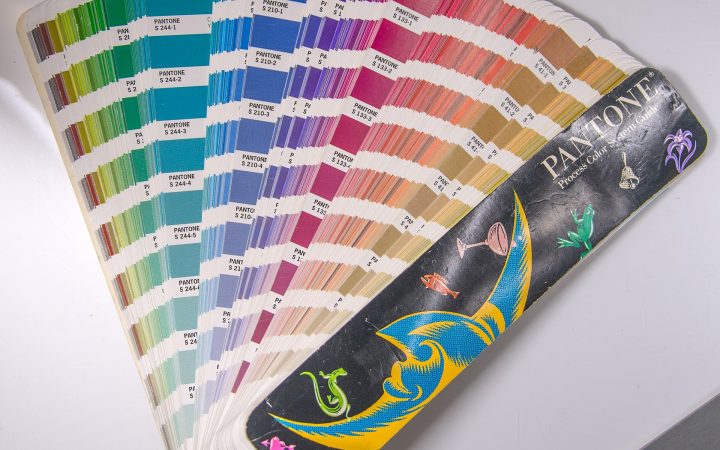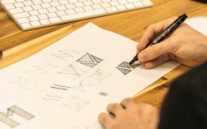
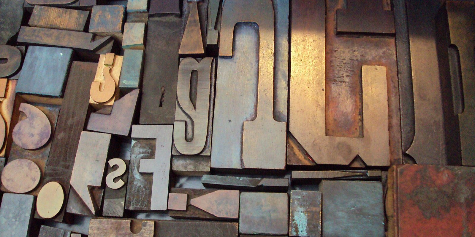
Every piece of text your business puts out — your signboard, visiting card, menu, website, Instagram posts and invoices — speaks in a visual voice before anyone reads a word. That voice is typography. The right fonts make your business look trustworthy, modern, friendly or premium; the wrong ones can make even a great business look careless or hard to understand. You do not need to become a designer to make good decisions. This guide covers the typography basics every business owner should know, so you can brief designers confidently, judge designs clearly and keep your brand consistent everywhere.
What Is Typography — and Why Should You Care?
Typography is the art of arranging text so it is readable, clear and visually appealing. It includes choosing typefaces, but also size, spacing, line length, alignment and how different text elements relate to each other. Good typography is often invisible: people simply find the content easy to read and the brand pleasant to deal with. Poor typography gets noticed — usually for the wrong reasons.
- It shapes your brand personality as much as colour and logo do.
- It makes information easy to scan, so customers find what they need quickly.
- It builds trust — consistent, well-set text signals professionalism.
- It improves results on websites, menus and ads by making key messages stand out.
- It keeps your brand recognisable across print and digital materials.
Typeface vs Font: A Quick Clarification
A typeface is the overall design family, such as a particular sans-serif family. A font is a specific style within it — for example, bold or italic at a given weight. In everyday conversation, people use the words interchangeably, and that is perfectly fine. What matters is knowing that most good typefaces come in a range of weights (light, regular, medium, bold) which let you create variety without introducing new families.
The Main Font Categories
Understanding the main categories helps you choose fonts that match your brand personality.
| Category | Characteristics | Personality | Best used for |
|---|---|---|---|
| Serif | Small strokes (“feet”) at the ends of letters | Traditional, trustworthy, established, literary | Institutions, legal, publishing, premium brands, long printed text |
| Sans-serif | Clean letters without serifs | Modern, clean, friendly, straightforward | Websites, apps, signage, tech, most small businesses |
| Slab serif | Thick, block-like serifs | Bold, sturdy, confident | Headlines, construction, automobile, rugged brands |
| Script | Imitates handwriting or calligraphy | Elegant, personal, romantic, creative | Wedding invitations, boutiques, bakeries — in small doses |
| Display / decorative | Unique, stylised designs | Playful, dramatic, themed | Posters, event titles, logos — never body text |
| Monospace | Every character takes equal width | Technical, precise, retro | Tech brands, code, special accents |
Five Typography Principles That Make the Biggest Difference
1. Limit Your Fonts
Two typefaces are usually enough for a brand: one for headings and one for body text. Sometimes one versatile family with several weights is all you need. Using many different fonts on a single flyer is one of the quickest ways to make it look amateur.
2. Create a Clear Hierarchy
Hierarchy tells readers what to look at first, second and third. Use size, weight, colour and spacing to distinguish headlines, subheadings, body text and small print. On a poster, the main offer should be readable from a distance; the terms and conditions can be small. On a website, headings should clearly break content into sections.
3. Prioritise Readability
Readability is about how comfortably people can read longer text. A few practical guidelines:
- Size: on websites, body text around 16 pixels or larger is a sensible baseline; in print, roughly 9–12 points depending on the font and audience.
- Line length: aim for roughly 50–75 characters per line. Very long lines tire the eyes; very short ones break the rhythm.
- Line spacing (leading): around 1.4–1.6 times the font size usually works well for body text.
- Alignment: left-aligned text is easiest to read for longer content. Use centred text only for short headings or invitations.
- Contrast: dark text on a light background is the most readable combination. Avoid placing text over busy photos without an overlay.
4. Pay Attention to Spacing
Spacing makes a surprising difference. Kerning adjusts the space between specific letter pairs; tracking adjusts spacing across a whole word or line. Logos and large headlines often need manual kerning to look balanced. Generous margins and space between paragraphs also help text breathe.
5. Be Consistent
Use the same fonts, sizes and styles for the same purposes everywhere. If your headings are bold and blue on your website, they should look similar on your brochure and social posts. Consistency is what turns typography into a recognisable brand asset.
How to Pair Fonts
Font pairing is about combining typefaces that complement each other without competing. Some reliable approaches:
- Serif headline + sans-serif body: a classic pairing that feels both established and modern.
- Sans-serif headline + serif body: great for editorial content and long-form reading.
- One family, multiple weights: a bold weight for headings and a regular weight for body — simple and always cohesive.
- Display font + neutral sans-serif: let a characterful display font shine in headlines, supported by a quiet, readable body font.
Avoid pairing two fonts that are very similar but not identical — they look like a mistake rather than a choice. Contrast in style is what makes pairings work.
Typography for Malayalam and Bilingual Designs
Many Kerala businesses need to communicate in both Malayalam and English — on signboards, posters, menus, wedding cards and social media. Bilingual typography needs extra care:
- Choose matching personalities. Pair a Malayalam typeface and an English typeface that feel similar in weight, stroke contrast and mood, so they look like one family.
- Balance visual size. Malayalam and Latin letters at the same point size can look very different in height and density. Adjust sizes so both languages appear balanced.
- Allow extra line spacing. Malayalam script has rich vertical forms and conjuncts, which often need more generous line spacing than English.
- Use proper Unicode fonts. Well-made Unicode Malayalam fonts render text correctly across devices and websites. Free, openly licensed families such as Noto Sans Malayalam and Manjari are available for both print and web use.
- Mind the script style. Some fonts follow traditional script forms and others reformed forms. Choose deliberately based on your audience’s preference and the feel you want.
- Always proofread with a native reader. Small rendering issues or typos are easy to miss if the designer does not read the language fluently.
The same thinking applies to Arabic calligraphy and text, common in institutional and religious branding in Malappuram. Our calligraphic logo for the Darimees Central Council and magazine and supplement layouts — such as the SKSSF Muttipalam unit supplement — show how carefully handled script and layout can carry a lot of information while staying graceful.
Tip: Fonts are software, and many require a licence for commercial use — including on logos, signboards and websites. Free fonts downloaded from random websites may not be licensed for business use. Openly licensed libraries such as Google Fonts are a safe option, or buy a proper licence from the type foundry. Ask your designer which licences cover your brand fonts.
Typography Across Your Brand Touchpoints
Logo
If your logo includes your business name, the typography is central to the design. Customised lettering usually looks more distinctive than a font typed as-is. A professional logo creation process will refine letter shapes and spacing until the name feels unique.
Website
On the web, readability and loading speed both matter. Use a limited number of web fonts and weights, set comfortable body sizes, and test on small phone screens. Good web design treats typography as a core part of the user experience, not decoration.
Print Materials
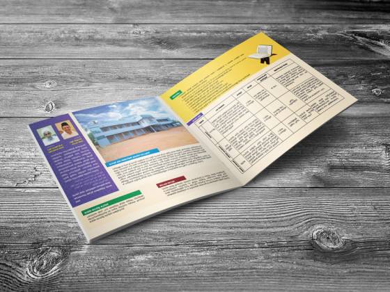
Brochures, magazines, calendars and visiting cards each have different needs. Long-form content like a magazine or a souvenir benefits from a well-planned typographic system, which is why magazine layout work relies heavily on grids, styles and hierarchy. Visiting cards need crisp, readable small text, while posters need bold, legible headlines that work at a distance.
Social Media
Social media creatives are viewed quickly on small screens. Use bold, short headlines, avoid too many words on a single graphic, and keep your brand fonts consistent across posts so your content is recognisable as people scroll.
Common Typography Mistakes
- Using too many fonts in one design.
- Setting long paragraphs in all capitals, script or decorative fonts.
- Stretching or squashing text to fit a space instead of resizing it properly.
- Text that is too small, too light or too low in contrast.
- Placing text over busy backgrounds without an overlay.
- Inconsistent fonts across signboard, website and printed materials.
- Using unlicensed fonts for commercial work.
Create a Simple Typography Guide for Your Brand
You do not need a thick brand manual. A one-page typography guide is enough for most small businesses:
- Heading font and body font (with names and where to get them).
- Weights to use — for example, bold for headings, regular for body.
- Recommended sizes for web, print and social media.
- Malayalam or Arabic fonts that pair with your English fonts.
- Colour of text on light and dark backgrounds.
- A few examples of correct and incorrect usage.
Share this guide with anyone who creates materials for you — designers, printers, sign makers or your own staff — so your brand looks consistent during busy periods like Onam, Eid, Christmas or wedding season when materials are produced quickly.
Key takeaways
- Typography shapes how customers perceive your brand before they read a word.
- Stick to two typefaces or one versatile family with multiple weights.
- Use size, weight and spacing to build a clear hierarchy.
- Prioritise readability: comfortable size, line length, spacing and contrast.
- For bilingual Malayalam-English designs, match personalities and balance visual size.
- Use properly licensed fonts and document your choices in a simple guide.
Frequently Asked Questions
How many fonts should a business use?
Two is ideal for most brands — one for headings and one for body text. A single family with several weights can also work well. More than three fonts usually makes designs feel inconsistent.
Are serif or sans-serif fonts better for a business?
Neither is better in general. Serif fonts often feel traditional and authoritative, while sans-serif fonts feel modern and clean. Choose based on your brand personality and where the text will mostly appear.
Can I use any free font for my logo?
Not always. Check the font’s licence to make sure commercial use is allowed. Openly licensed fonts, such as those on Google Fonts, are generally safe for business use, but always confirm the terms.
What is the best font size for a website?
A body size of about 16 pixels or larger is a good baseline for readability on most screens. Headings should be noticeably larger, and you should always test the site on a smartphone.
How do I make Malayalam and English text look good together?
Choose typefaces with similar weight and style, adjust sizes so both scripts look balanced, give Malayalam text a little more line spacing, and have a fluent reader proofread the final design.
Want typography that makes your brand look clear, consistent and professional across print and digital? Contact Dzone Ads and let’s shape your brand’s visual voice together.